Stockholm is the latest photo magazine theme designed by our modest teammate Ceyhun. Even though Ceyhun joined our team back in mid-2011, he has worked on significantly improving our back-end and framework. A few months ago he shared a first draft of a photography-inspired theme and we immediately fell in love with the balance and simplicity of the design. We made it a priority to to implement the design and code into our framework so that it would be ready immediately.
When this theme was revealed, we decided Stockholm was the the perfect name for it’s light and dark personality. There are not many places in the world where darkness occurs for 24 hours or the sun never sets depending on the time of the year. This theme, and its name, is inspired by the beautiful Swedish capital. Stockholm offers an unique and balanced layout for a magazine or photography theme. The contrast is perfect for showcasing high-quality images.
Solid Large Slider
As with most of our themes, Stockholm comes with an excellent featured slider to showcase your best photos or posts. From the theme options panel, you can edit the number of entries displayed on the slider.
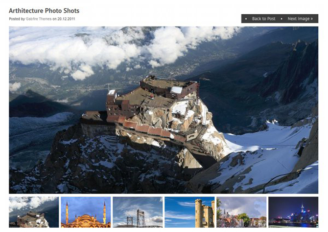
Attachment Page
An eye-catching attachment page displays your photos in a neat layout. The idea behind was to mirror and at the same time will give the feeling a photo album.

Multiple Category Layouts
You love having the ability to change the format of category pages from boring lists into 2 column grids or a media gallery style, dont you? Well, category templates functionality is included in this theme as well. From the theme’s options panel, you can define any category to be displayed using any of these layouts.
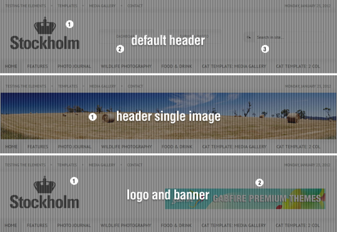
Multiple Header Layouts
Beside the regular header you see on demo, the theme comes with a single image header style and 3rd header style where log is aligned left and and ad spot is reserved for right spot. The switch between headers is a click on theme control panel only. There is no coding required.

Media Gallery Module
As a standard Gabfire Themes feature, we have implemented our awesome media gallery module into Stockholm too. You can post any media entries under multimedia custom post type and the theme will handle the rest.
Custom Query Widget
Need more ways to customize your site? If so, you’ll love our newest and extremely powerful Custom Query Widget. Using this neat widget, you can add more content areas throughout the front page, as well as within sidebars.
13 Responses to "Stockholm Magazine – Balance and Simplicity of the Design"